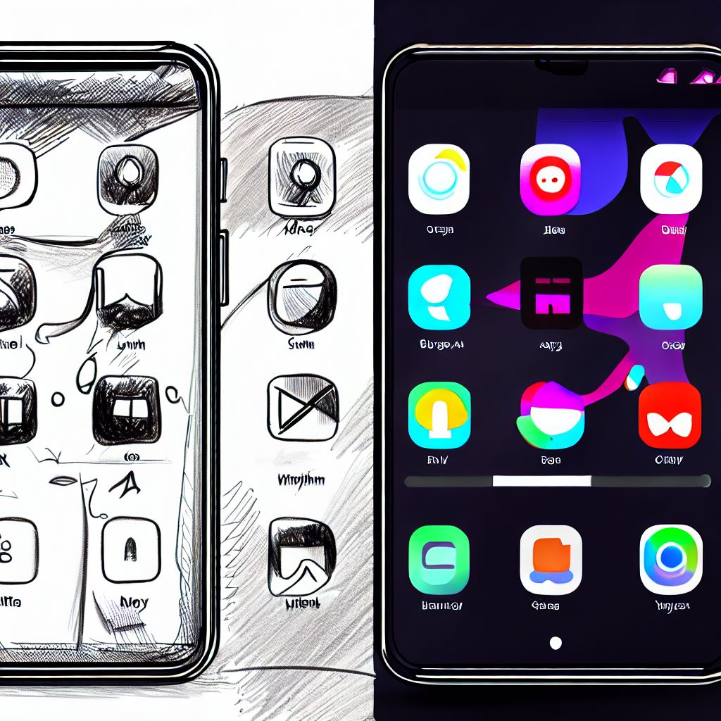
Turning Crude Mockups into App Reality
Oct 31, 2023
Oct 31, 2023
Oct 31, 2023


In the second week of our journey to create the Study Planner app, we've achieved significant milestones and tackled exciting technical challenges. Join us as we dive into the details of our progress and the valuable insights gained along the way. 🚀
Milestones Achieved 🏆
[Rahil]: Our goal was to get the app's front page up and running, and we accomplished it by converting client mockups into React pages. Notably, we successfully integrated an animated dynamic countdown gauge, enhancing the user experience.
[Enrique]: Working on the second and third pages presented in client mockups, we replicated and improved upon them. We also made a swift transition from a dark theme to a more professional light theme based on client feedback within a day. This involved meticulous attention to detail and adjustments to ensure the final result met the client's expectations.
Jump into our Demo 🎥
Demo #1: Responsive Countdown Gauge using React.
Demo #2: Design Evolution and React Components
Technical Insights 💡
[Rahil]: The hardest part to work on by far was the countdown gauge. It was an svg gauge taken from codepen which was refactored for our purposes. The one on codepen was written with pure html/css/js and involved js functions like getElementById.
Directly using them in react will give you an error because it tries to access the element before it is loaded on the DOM. The solution I came across was to use State instead, completely eliminating the need to reference the elements themselves. Also, to animate the gauge 'useEffect' was used cleverly to prevent too many re-renders which would also cause an error. You can explore the original CodePen design here.
[Enrique]: React's component-based approach significantly accelerated development, allowing us to create pages with similar UI efficiently. This reusability minimized the effort required for pages with similar layouts.
Learnings 📚
[Rahil]: Implementing state management in React to eliminate direct HTML referencing was a significant learning moment. It showcased the power and purpose of using React in complex UI projects.
[Enrique]: Personally, I learnt how important fast communication is and how it can make your workflow more efficient. Our client gave us rapid feedback which helped us cater to their needs and make modifications as soon as possible.
Resources 🛠️
CodePen provided valuable gauge designs and other components.
Stack Overflow was our go-to resource for debugging and learning throughout the week.
Net Ninja & Web Dev Simplified are great YouTube channels for complete beginners due to their project-based teaching approach. These channels also have dedicated playlists for a particular topic, so all the resources are present at a single place.
Tips for Peers 🚀
If you're facing similar challenges, remember this: "JUST GET GOING." Learning while building is an excellent approach to familiarize yourself with new technologies and overcome hurdles efficiently.
Future Plans 📅
In the upcoming week, our focus shifts to designing the backend. In particular, we will be implementing Google authentication and optimizing session management to prevent repetitive logins. We're excited about the progress ahead!
Additional Comments 📢
We want to emphasize the importance of effective communication in the development process. Timely client feedback was instrumental in shaping our progress and ensuring that we meet their expectations.
Stay tuned for more updates next week, and be sure to join the 350+ people already following the Study Planner Web App Challenge through our newsletter sign-up form. 📩
P.S. Found our blog helpful? Share it with friends who might benefit from it and help us grow our community of learners and innovators!